Marketing campaigns that need to convey a heavy amount of information typically rely on brochures as the marketing tool to do so. The layout of a brochures offer some versatility in that they can be used to display menus for restaurants or contain a listing of different products and services your business may offer. They can also function as program event guides or travel guides. Guru Printers offers custom brochures in standard as well as custom sizes. Here is our guide to help you in the design and layout of your next brochure.
Folds and Size
The size of your brochure will depend on the amount of information you are trying to convey. At Guru Printers we offer five standard brochure sizes as well as five different types of commonly used paper folds. We suggest that you start with a outline of the content you want to include in your brochure to get a better sense of the brochure size that will work best for you.
In picking the right fold option for your brochure please consider the size of the paper and whether your orientation is vertical or horizontal.
On the Guru Printers website you will find blank brochure templates in standard sizing and folds which you can use to help you with your layout. One of our most popular standard brochures is the classic 8.5×11 tri-fold brochure.

Choosing The Right Size For Your Business
Our standard brochure sizes range from 5.5″ x 8.5″ to 8.5″ x 14″ for businesses that want to convey information about their goods and services. Here are some examples of instances where these sizes can be used:
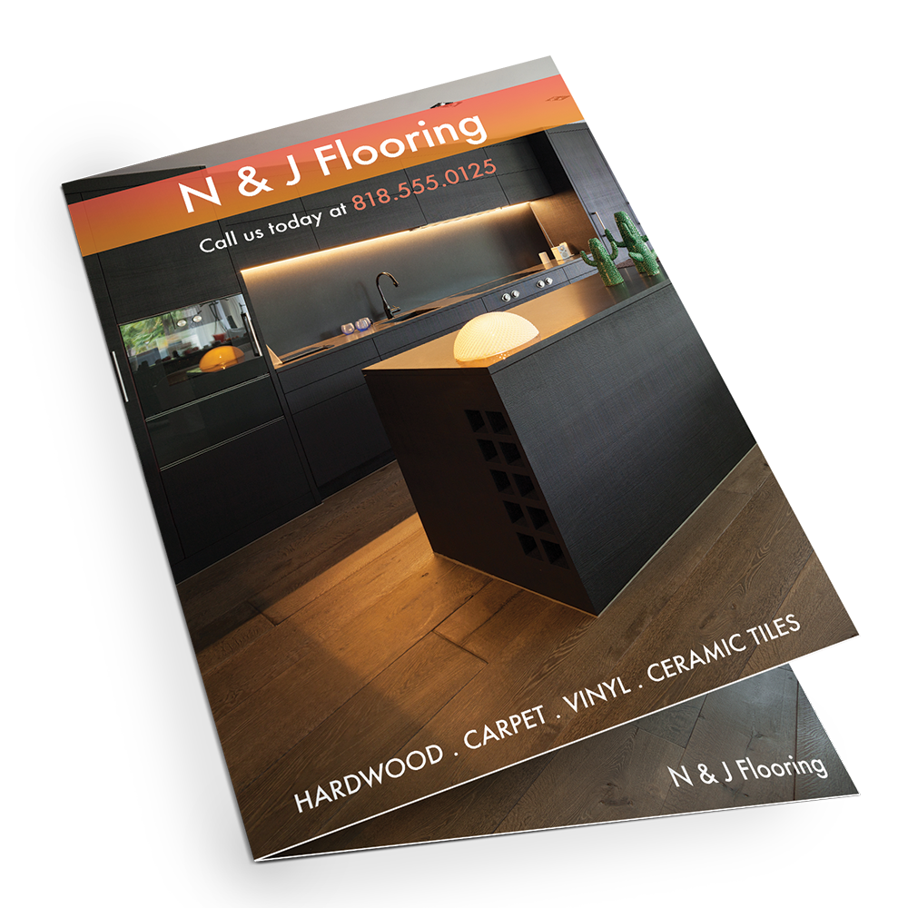
- Service Providers– Whether you’re running a dance studio with different classes and instructors or running a sculpture studio specializing work with different materials, brochures are a good way to showcase samples of your work, different classes offered, promotional packages and contact information.
-
- Medical Professions– For those in medicine brochures can function as informative guides presenting health services for various conditions as well as brief information about the service providers and their extensive experience in the field.
-
- Real Estate Agents & Brokers – For those in real estate who want to entice their clientele with descriptions of their residential or commercial properties, detailed property specs, addresses and contact information.
-
- Conventions & Trade Fairs – Companies that partake in trade shows and conventions can make great use of brochures to communicate with their target audiences. Brochures are a great way to distinguish your brand from the competition while showcasing your products and service.
-
- Program Guides – A simple two fold or tri-fold brochure can serve as a concise program guide for various events like performances in the arts or weddings.
-
- Tourist Guides & Maps – For those in the travel and hospitality business brochures can include maps and travel tips which can help guide tourists. A good example of these are the standard brochures at hotel check in counters or the guide maps found in souvenir stores of national parks.
Brochure Layout Of Text
In creating the layout of your brochure play close attention to spacing when it comes to images and text. Allow for as much space to avoid clutter or crowding of information while at the same time ensuring that your brochure layout and it’s various design elements are visually engaging.
Fonts
-
- Select fonts that are easy to read like Helvetica or Times New Roman.
-
- Try to stick with no more than two types of fonts in order to avoid your brochure from being cluttered or distracting. If you want more variation in font, try experimenting with highlighting certain key information with bigger font size, bold or italic rather than using a different font style.
-
- Typically bigger font size is used for headlines, taglines or calls to action.
-
- The amount of information you want to provide will influence the size of your brochure which in turn will influence the size of your fonts.
Alignment Of Text
-
- Remember to use bullet points instead of large paragraphs. To much text bunched up in a paragraph is usually ignored by readers so keep your message eye-catching and to the point.
-
- Experiment with the alignment of your typography by making use of left, right, justified, and center alignments for an evocative layout.
-
- Make sure that your design element like images, headers and accompanying text are properly aligned too.
-
- Remember that sometimes less is more and that you allow for proper spacing between all the elements of your brochure. Leave plenty of empty space in your layout to make it easy on the eyes in a well-balanced form. Your readers will thank you.
Leave a Reply