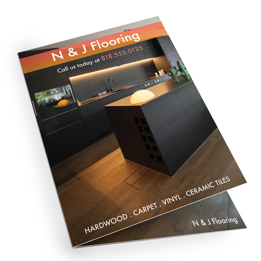
Brochure Design Tips

If you’re looking to create one of the most practical marketing materials for most business owners, then a brochure may be the right choice for you. Not only are they a great addition to your various other forms of marketing tools but they are very versatile and cost-effective.
A well-made brochure adheres to design guidelines and is well planned out in its layout of information. You want to make your brochure remarkable in terms of design but also informative to thoroughly get your message across. Here are Guru Printer’s tips for designing brochures that will stand out and leave an impression:
-
Keep Your Design Practical
It’s best to keep practicality in mind in all aspects of printing from design to layout and finally to the finished product. A well-designed brochure should be easy to read, balanced in design, and budget friendly to print. Stay clear away from oversized or oddly shaped brochures.

-
Lead With Intent And Focus.
Before designing your brochure, you need to have a clear intention and focus behind the message of your brochure as it relates to your marketing plan and perhaps your other marketing material. In essence, your brochure should clearly communicate the mission statement of your brand and business through information and visual presentation.
-
Eye Catching
Originality in the concept of your design will set you apart from others. Have your brochure designed by a graphic professional to make a visual impact. Lastly, do not settle for anything lesser than the highest quality printing services. Your brochure is a visual statement that should be as professional and unique as your brand.
-
Make It Easy To Grasp.
When presenting the information within your brochure it’s best to stick to a point of focus. We recommend that you organize the information with the help of infographics, text boxes and bullet points in a simple word document before getting to the nitty gritty of your design. In this manner your readers will find your brochure easy to grasp and understand.
-
Use Of Color
Another factor in making your brochure eye catching is the use of color. Depending on your needs and the identity of your brand it is recommended that you consider whether you want to go with a bold multi-color palette or keep it confined to three or four colors. Color is a crucial element in the visual presentation of your brochure and can distinguish a high-quality print brochure from one of lower quality.