A business card is an essential marketing tool that is often the first impression people get about your business through interactions and networking.
Done right, a business card can hold attention just as much as any other marketing tool.
The right first impression may lead to new loyal customer, next sale, pitch or partnership. From a statistical standpoint handing out business cards eventually does culminate in palpable difference in sales and brand awareness.
How to stand out
There are various ways that design can grab attention and bring distinction to the details printed on a business card. The right font and typeface helps to highlight your name, the name of your company, and contact details. Typically a standard or square business card is well suited for a classic bold font that evokes confidence in your brand, your business and what you’re about.
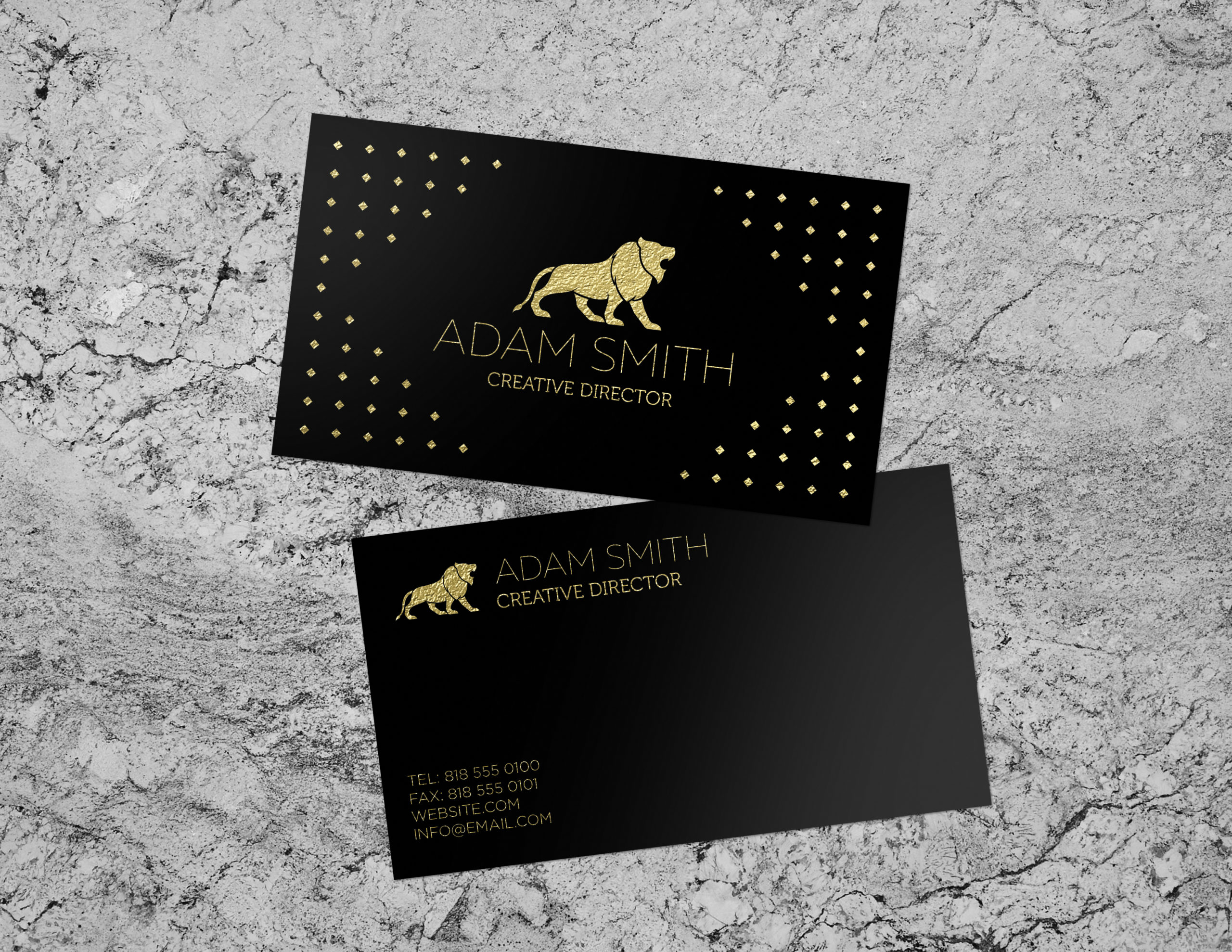
Another key design element in helping you stand out is the use of bold color. Saturated tones will stand out against the backdrop of black and white or more primary color combinations. It has become very popular to incorporate illustrations within and around logos as the combination of those elements help break from the mold by offering more creative freedom.
Showcasing your service or product through illustration or photography always gives business cards an artistic appeal.
Giving the design of your card creative attention and personalization can really pay off in the long run.
Keep in mind however that too much design or clutter may overpower your message and the other details in your card. Strike the right balance by keeping it simple while taking creative risks. Let the design exude the identity of your brand.
—————————————————————————————-
As your local business card printing service Guru Printers has put together a guide on things to look out for when designing and printing your next batch business cards.
One size and shape does not fit all
A standard rectangular card has stood the test of time and has it’s merits. But going with a more non-traditional shape like a die-cut business card, a circle, or oval shape will help you stand out among the others whom your potential client may encounter. Again, select a shape and size that is in line with your business and brand’s identity.
The shape and size of your business card should correlate with the services and products your business offers.
Don’t go over the top in design.
Keeping it simple and minimalistic is often a good rule of thumb. In most cases less really is more. Stay away from design elements that clash or lack harmony with each other. Eye-catching is also synonymous with being easily discernable while grabbing attention. A simple black or white backdrop can go long way in navigating the eyes to the essential message on your business card.
As a matter of fact it is only the most essential information that you want to include on the surface of your business card. A well designed logo, your company name and contact information such as your phone number, email, and social media handle. Stick with one phone number as opposed to multiple lines. The same holds true for your social media. Include only your most popular or traffic laden social media handle.
Make use of unique printing processes, finishes and materials.
A standard plain surface, white background and maybe the occasional primary color thrown in is not what will make your business card stand out.
Guru Printers offers many ways to break the mold when it comes to the material, finish, and printing processes of your business card.
For example, we have plastic printers and offer plastic business cards for those wanting something more unconventional compared to regular paper stock. Plastic business cards are eye-catching in their modern appeal while the material itself has a uniquely transparent look to it. Plastic business cards are also quite durable and water resistant as opposed to standard paper stocks
We also offer Spot uv business cards that are very popular due to their bold and sleek look. This type of finish acts as a coating that can be added to select parts of your design. When applied to a modern minimalistic logo it can really add gravity to your business card while communicating trust and professionalism.
Go With Thicker Paper Stock
Most classic business cards that are done in super large batches for corporations are on standard 14 pt. paper stock. Although this is that “standard” practice it may not be suited for the unique identity of your particular brand or business.
At Guru Printers we offer a variety of paper stock options. Thicker cardstock options like 16 pt. and 18 pt. are more durable and generally less prone to being damages. This thicker stock feels heavier in hand and quite different in touch in comparison to thinner paper stock.
Use both sides of your business card
Utilize both sides of your business card and get more bang for your buck!
The information on the front side of your card must correlate with what is on the back. Often the essentials like a logo, company name, tag line and contact info can be put on the front of the card. But we also have many clients who reserve the front only for a logo and/or illustration that gives customers an impression of the products or services they provide. They then opt to print the more detailed information like contact on the back.
Another great option is to utilize the back of your card for printing a QR code that when scanned with a phone navigates your card viewers directly to your desired web landing page.
Leave a Reply