When typing in your business card name in your business card template it can be overwhelming to decide on just the right font for your business card while having to scroll through countless font options to find the right fit.
The right font would be firstly easy to read and also eye-catching. It is no small task because your business card and it’s various elements can often be the first impression people get from your brand and business.
At Guru Printers we’ve devised a guide for helping you choose the best fonts for your business cards. We touch on the various types of fonts, style combinations and sizes.
The definition of a font is simply a set of a set of printable or displayable typography or text characters in a specific style and size.
Serif & Sans-serif font types.
In typography, a sans-serif is much less decorative than serif. Those embellishments of ornamental lines or serifs are absent in “san-serif” fonts. Another feature of Sans-serif fonts is that they have little to no line width variation in comparison to serif fonts. When used on printed marketing material sans-serifs is optimal for headings or business names due to their easy readability and bold simplicity.
Sans-serif fonts within the digital realm also read very easily in comparison to Serif which due to it’s decorative nature might not appear as clear or sharp on displays with lower resolution. In short, Sans-serif is going to be your main font for printed and digital material due to its easy readability and eye-catching design.
What is a serif font?
Serif fonts are much more ornamental and decorative which can give your brand name either a unconventional or traditional look depending on use.
Serif fonts and typefaces are usually used in lengthy bodies of text like books, articles and manuscripts. .
For printing purposes make sure you use larger text sizes if you are adding an embossed gloss finish to a serif font to improve readability.
Where to use script fonts
Typefaces with a script font style have a more organic look, like human handwriting, cursive or calligraphy writing. Use script fonts for greeting cards, invitations, personal messages and headlines. This typeface in its classic form has an elegance to it fit for the formality of some of the examples in the previous sentence. You can also go with a slightly more round script font to convey something more fun and less formal looking.
Scripted typefaces grab attention. Keep in mind however that you want your message to still be readable. We don’t recommend script fonts for large sections of text. Short messages or headlines work best with this style.
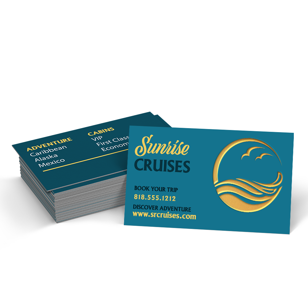
Combining Fonts On A Business Card
In designing a business card, it’s best to stick to no more than two fonts. Firstly, create a hierarchy of visuals to layout the information you want to be of most to least prominence. For example, typically on a business card the name of your business and your name would be the two most prominent elements. All other information like your contact details and social media handles, can be set with a different font and/or font size.
Some quick tips from Guru Printers for fonts on a business card:
- Use a combination of one script or serif font with a sans-serif.
- Don’t combine fonts that look too much alike.
- Experiments with weights (boldness, regular, italic) for more contrast.
- Try to stick to only two fonts.
- Use color and text to create contrast between background and foreground.
- Use 10pt-16pt font size for your more prominent text fields like your name and the name of your company.
- Go with smaller font sizes for additional info like your contact information.
Leave a Reply