Sticker Printing to Get Your Message Across!
Given our era of high-tech gadgets and distractions it’s easy to see why the attention span of the average person is very short and limited. Knowing this it is smart to design your order of stickers or labels by keeping the message short and eye-catchingly to the point.
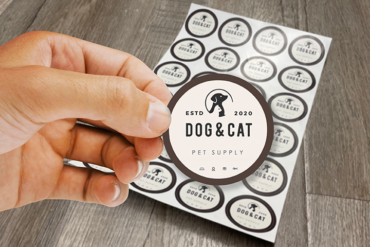
Stickers are a great marketing tool you can use to grab the attention of your target audience. Branding and representing your company through a well-designed sticker is often one of the most cost-effective ways to make an impact. The contents of a great sticker can be as simple as a well-designed logo and/or tagline. The proper use and layout of color, graphics, font, patterns and shapes depends on the identity of your brand, what it represents and your central message.
Here is Guru Printers guide to helping your design your next batch of die-cut stickers, standard stickers, or labels.
Use Shapes That Guide The Eyes
You can implement geometric shapes or pattern that carry the eyes toward the central message of your sticker whether that be your company logo or slogan.
Use Repetition Of Popular Cultural Themes
Making references to well-known themes within pop culture without plagiarizing anything can be tricky but done just the right way it can be highly effective. A good example would be bumper stickers that play on the “Got Milk” ad campaign for the dairy industry. Many boutique brands would replace the word “milk” with something of their own specialty.
Use Contrast And Color
A great way to catch the eye is through the proper implementation of color and contrast. A good example would be a red background with yellow text. Keep the color palette simple yet alluring.
Allow For Space And Simplicity
Don’t clutter your sticker design with too much text or distracting graphics. Allow for negative space, leaving empty in between the various elements in your sticker.
Leave a Reply