Order Yours Today!
As populations and technologies continue to grow, it can be harder to get your message seen by others. It’s easy enough to scroll past an ad on a social media site. But it’s a lot harder to ignore a physical poster that you see on your daily commute or while you’re waiting in line in the city. By using wheat paste posters, you can help promote your event, market your company, or showcase your artwork. No matter what you choose to do with your posters, though, you need to start with the perfect design.
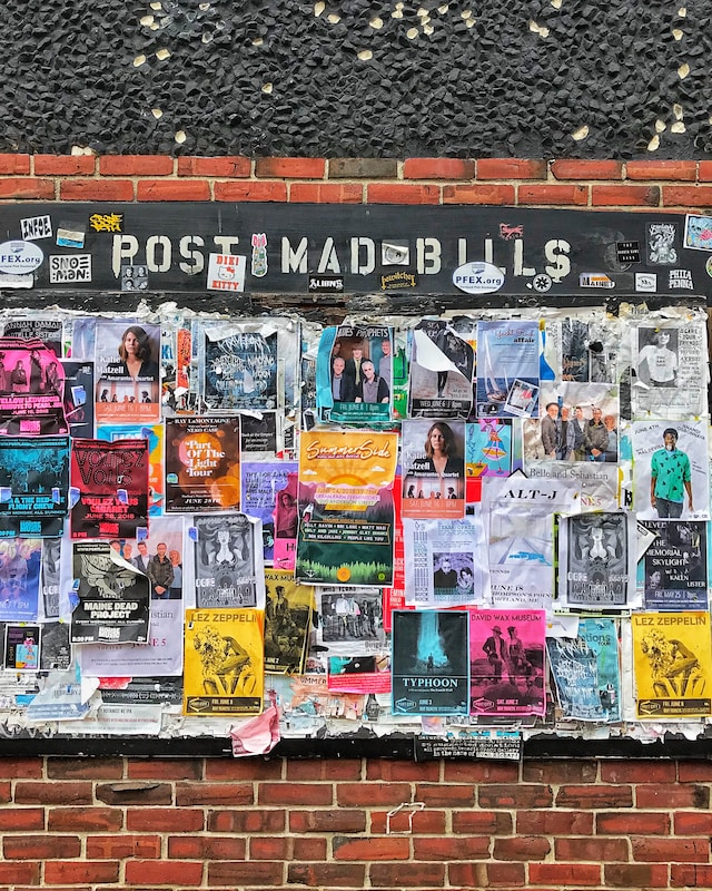
Design Elements for Wheat Paste Posters
Every wheat paste poster needs a collection of design elements to work effectively. However, the balance between those elements will change depending on the purpose of your poster. Wheat paste posters that have the wrong elements will not be as efficient at promoting yourself or your cause as you want them to be. There are three main elements you need to keep in mind when designing your posters.
Images
Images play a big role in catching attention for your poster. Without any images at all, people are hardly likely to stop by and take a look. However, if you overfill your poster with too many images, you might lose your message in the process. Here are some handy tips for dealing with images in your wheat paste posters:
- If you’re displaying artwork, use one powerful image instead of a collage.
- If promoting an event, try using two or three pictures of past events that showcase the venue or people in attendance.
- If promoting a political campaign, use some action shots of the candidate or group helping the community.
Finding the right images to use can be tricky. But if you get the right ones on your posters, you’re improving your odds of furthering your cause.
Text
Text on a poster is difficult to balance. On the one hand, you want enough text there to say what you need to say. On the other hand, if you have walls of text on your posters, people won’t take the time to stop and read it all. Here are some useful tips you can use to find the right balance of text on your wheat paste posters:
- Only include the most important information needed to capture attention. For everything else, include a link or QR code to a website explaining the details further.
- Make sure you use a large, legible font. Tiny text in a decorative font is difficult to read, and most passersby won’t stop to make the effort.
- Use a color for your text that complements your other design elements. Too much contrast is hard to look at and may turn viewers away instead of drawing them in.
Once you have the perfect balance of text on your poster, you’ll be able to grab people’s attention and fill them in on your cause.

Photo by Brandi Alexandra on Unsplash
Contact
While it’s not as important as images and text, it’s a good idea to make sure there’s a way for people to contact you from your poster. If you don’t have contact information available, then anyone with questions or interest in your cause won’t be able to act on them. When including contact on your poster, keep the following tips in mind:
- Use a shortened URL or a QR code to help people quickly and efficiently find you online.
- If you’re including a phone number or email, make sure you get a non-personal account for it to avoid unnecessary spam in your daily life.
- You can get away with not including a specific contact at all as long as your business/cause name is unique enough that a quick online search will find your website/socials.
Once people can contact you about your art, event, or business, you can see the benefits of wheat paste posters paying off in a real way.
File Specifications for Wheat Paste Posters
Even if you have the perfect design on your computer, you could still end up with an imperfect print. Files created on your computer are by default set to enhance your poster for on-screen use. When you send these files to a physical printer, however, these settings can quickly upset the process. To make sure your wheat paste posters print properly, make sure you double-check the following settings before hitting send.
Bleed Area
Printing machines have a small margin of error where shifting can occur during the cutting process. If you don’t include a bleed area in your design, you may lose important text or design elements. A ¼” area around your poster is enough to help prevent this loss and keep your design intact.
Color Spectrum
If you want the vibrance and colorfulness of your poster to stay as it is when printed, make sure you change the color spectrum setting. Most image editing software defaults the color spectrum to RGB (Red, Green, Blue), as that’s how computer screens filter colors. Printing machines, however, use the CMYK (Cyan, Magenta, Yellow, Black) spectrum. If you don’t change this setting, you may end up with a discolored print.
DPI
Image crispness and quality are important. The higher your DPI (dots per image), the better your pictures will print. Most image editing software sets the DPI at 75, which works well on screens. However, for a perfect print, you’ll want to set the DPI to a minimum of 300.
Get Wheat Paste Posters Printed in Downtown Los Angeles
Posters are a fantastic way to get your message out to a lot of people at once. For high-quality wheat paste posters delivered quickly, trust Guru Printers with your order. Our business has always been centered around helping your business and creative projects shine. To order your wheat paste posters today, start by filling out our online order form. You can also contact us at (213) 320-4865 or [email protected] for more information or help with your order.